Color influences how people perceive your product, remember your brand, and decide to purchase. In a crowded market, the right packaging color can help your product stand out and build trust at first glance.
This guide will help you select a color that reflects your brand, resonates with your audience, and performs well in actual packaging production.
Why Packaging Box Color Matters in Branding?
Color isn’t just a visual detail; it’s a silent ambassador for your brand. The right packaging color can drive recognition, shape emotional connection, and influence buying decisions within seconds.
Color Is the First Brand Impression
In the world of packaging, color is the first thing your customer notices, often before they read your logo. This initial impression triggers subconscious associations about your product’s quality, personality, and price point.
A luxury skincare box in matte black with gold foil communicates exclusivity and elegance. In contrast, a Kraft paper box with green accents might signal sustainability and eco-conscious values. Both messages are delivered instantly through color.
For startups and established brands alike, this first impression sets the tone for how your packaging performs on shelves, in unboxing videos, or across online marketplaces. It’s a key touchpoint in shaping how your brand is remembered.
The Role of Color in Purchase Decisions
According to research by the Institute for Color Research, people make subconscious judgments about a product within 90 seconds, and 62% to 90% of that assessment is based on color alone.
In global environments, where buyers must choose between dozens of competing packaging solutions, a well-selected box color can trigger confidence and familiarity. It enhances perceived value, especially when buyers associate certain hues with premium quality or category norms.
Color also supports functional differentiation, for instance, using color coding for product SKUs, size variations, or seasonal editions, making buyer decisions faster and more intuitive.
Color Enhances Unboxing and Loyalty
A study by Dotcom Distribution found that 40% of consumers are more likely to share photos of packaging that looks premium or unique. In branded packaging, color plays a starring role in this effect.
When buyers receive a package that feels tailored, visually and emotionally, they remember it. Branded color palettes that remain consistent across outer boxes, inserts, and wrapping create a cohesive, memorable unboxing experience.
This attention to detail isn’t lost on wholesale buyers or procurement managers. It signals that your brand understands quality from the inside out. Over time, consistent packaging color builds brand familiarity, which directly supports repeat purchases and customer loyalty.
Understand the Psychology Behind Packaging Colors
Color affects how people feel about your product the moment they see it. Choosing the right tone helps you connect emotionally with your customers and communicate your brand’s message.
What Different Colors Mean in Packaging?
Each color creates specific associations in the minds of consumers. Choosing the wrong one can distort brand perception, while the right one reinforces your message and value.
Red

Red evokes energy, passion, and urgency. On a packaging box, it captures attention instantly and creates emotional intensity. It suggests boldness, excitement, and action, making it ideal for brands that want to feel vibrant or powerful.
Green

Green represents freshness, harmony, and growth. In packaging box design, it signals balance and environmental responsibility. It’s often associated with nature, wellness, and calm, making it effective for conveying a grounded and trustworthy image.
Black

Black suggests sophistication, exclusivity, and authority. A black packaging box instantly adds a sense of depth and elegance. It communicates premium quality and timelessness, often linked to brands that value control and confidence.
White
White stands for purity, simplicity, and clarity. It gives packaging boxes a clean, modern appearance and supports minimalistic branding. It also helps other design elements stand out, adding a feeling of transparency and order.
Blue

Blue symbolizes trust, logic, and calm. When used in packaging box colors, it communicates dependability and professionalism. It often creates a sense of comfort and safety, ideal for building long-term customer confidence.
Brown

Brown evokes earthiness, authenticity, and warmth. A brown packaging box gives off natural, grounded impressions. It can suggest tradition, craftsmanship, or environmental awareness, while creating a tactile, honest brand image.
Gender, Age, and Cultural Preferences
Color selection also hinges on who you are targeting. Women tend to favor soft tones, blush pinks, muted blues, and warm metallics. For men, neutral, bold, or industrial shades like navy, charcoal, or matte black are more effective. Children respond well to high-contrast, bright palettes that energize and stimulate visual interest.
Age plays a role, too. Younger audiences may gravitate toward vibrant, experimental colorways. Older customers often associate trust and value with more conservative, subdued tones. Effective packaging design aligns with these psychological trends to create relevance and comfort.
Industry-Specific Color Insights

Color strategies are deeply tied to your business category. In the beauty and skincare sector, soft hues like peach, rose, and ivory are favored for elegance and cleanliness. In food packaging, rich tones like red, yellow, and green are often used to stimulate appetite and suggest freshness.
For luxury goods such as jewelry or high-end fashion, metallics, deep tones, and textured finishes like embossed black or burgundy reinforce exclusivity. Tech and electronics favor blues, silvers, and minimalist black-and-white combinations to communicate innovation and performance.
Choosing color without considering industry expectations can alienate your audience or misrepresent your product. But a carefully calibrated color choice can differentiate your brand while still aligning with what your customers expect and trust.
Global Packaging Color Preferences and Cultural Meanings
Color meanings vary dramatically across cultures, and what works in one market may backfire in another. Understanding regional color perceptions is essential when designing packaging boxes for international audiences or exporting across borders.
Western Countries
In Western markets such as the United States, Canada, and most of Europe, blue is widely accepted for trust and stability, while white suggests purity and modernity. Black is associated with luxury and minimalism. Packaging box colors in these regions often align with brand identity and aesthetic trends, with a growing preference for eco-friendly tones like muted green or kraft brown in response to sustainability movements.
Asia
In China, red symbolizes good fortune and celebration, making it ideal for gift packaging boxes. Gold represents wealth and prestige, often paired with red during festivals. In Japan, white conveys purity but may also be linked to mourning, requiring careful use. Green is favored for health-related products, while black implies formality or elegance depending on the context. Successful packaging in Asian markets often blends modern branding with culturally resonant colors to build trust and emotional connection.
Middle East
In the Middle East, color carries spiritual and cultural significance. Green is sacred in Islamic tradition and is seen as a color of prosperity and peace. Gold and deep purple convey royalty and opulence, making them effective for premium packaging boxes. Black is associated with strength, but should be used with restraint to avoid appearing somber. White often denotes cleanliness and virtue.
Subcontinent
Color is vibrant, symbolic, and emotionally powerful in countries like India, Pakistan, and Bangladesh. Red is widely used in celebrations and is considered auspicious, especially in wedding or gift-related packaging. Orange and yellow represent energy and joy, while green signals fertility and prosperity.
White, though symbolizing peace, is traditionally linked to mourning in many regions, requiring cautious use. Gold remains a favored color in luxury or festive packaging boxes. For this region, culturally appropriate and colorful packaging often resonates more deeply than muted, minimalist palettes.
How to Choose the Best Color for Your Custom Packaging Boxes?

Color selection should never be guesswork. It requires a strategic process that aligns brand identity, audience expectations, and product characteristics. The following steps will help you make informed, confident decisions during packaging development.
Clarify Your Brand Style
Every brand has a personality, and your packaging box color should reflect it with intention. Before choosing any hue, define how your brand wants to be perceived.
If your identity is refined and understated, soft neutrals or monochromes communicate calm and professionalism. For instance, Aesop uses muted tones and minimal graphics to project sophistication rooted in simplicity. In contrast, Fenty Beauty leans into bold, high-contrast visuals to mirror its inclusive, dynamic brand tone.
Your choice of color should answer:
- Are you classic or experimental?
- Luxury or accessible?
- Earth-conscious or technology-driven?
These distinctions directly influence whether you lean toward matte black, warm kraft brown, translucent white, or metallic finishes. The packaging box is often the first branded touchpoint your customer sees. Its color must carry the same emotional tone as your brand voice, website design, and product experience.
Consider Your Target Customers and Market
Demographics heavily influence color preferences. Younger consumers often respond to vibrant palettes, while older audiences may favor subdued, classic tones. Gender, lifestyle, and regional culture also shape expectations.
For example, pastel colors may appeal to female buyers in wellness categories, while matte blacks or steel blues work better for male-focused or tech-driven products. Use packaging box color to connect with how your customers want to feel, not just what they want to buy.
Match the Product Type and Industry
The nature of your product directly shapes which packaging box colors are most appropriate. A cold-pressed juice calls for earthy greens or vibrant citrus tones to reflect freshness and health. A luxury perfume, on the other hand, benefits from deep tones like navy or burgundy combined with metallic accents to suggest exclusivity. Industrial tools may use dark grays or bold primaries to convey durability and precision.
Each industry has visual cues that customers subconsciously expect. Aligning color choices with product function helps ensure your packaging feels authentic and instantly communicates category relevance.
Adapt to Campaign Needs
Product launches, seasonal editions, or promotional runs are excellent opportunities to step outside your standard color palette. These limited-use colors can spark urgency and make your offer feel timely. Just ensure that even temporary color choices don’t conflict with your core brand image.
For example:
- Holiday packaging might use metallic red, gold, or emerald green to evoke festivity.
- The summer campaign could use light turquoise or coral
- Limited edition drops benefit from vibrant or unexpected color shifts to draw attention and create urgency.
- Sustainable campaigns often lean on earthy tones, unbleached paperboard, or muted greens.
Ensure Brand Consistency
Color consistency builds recognition. Your packaging box should match the colors used in your website, social media, and retail displays. This doesn’t mean you must use the same shade every time, but tones should feel cohesive. Inconsistency can confuse buyers or weaken trust. Create a defined brand color guide and apply it rigorously across all packaging formats to maintain a unified visual language.
Benchmark Against Competitors
Review how direct competitors use color. Are they all using muted green to suggest sustainability? Is a certain tone becoming saturated across your category? Rather than blending in, look for opportunities to contrast wisely. A bold accent color or an unexpected base tone can help your packaging box stand out.
Test Before You Print
Color can shift dramatically from screen to substrate. What looks rich in digital mockups may appear dull or inaccurate when printed on kraft paper or matte board. Always request color samples or printed proofs from your packaging supplier. Test on actual materials under realistic lighting conditions. This is the only way to ensure your packaging box reflects the color you intended and performs consistently in full production.
How to Ensure Color Accuracy in Custom Packaging: Key Factors to Consider?
Getting the packaging box color right isn’t just about design; it requires precise coordination between color systems, materials, and print processes. This section outlines key factors that directly impact color accuracy during custom packaging production.
Understanding Color Systems
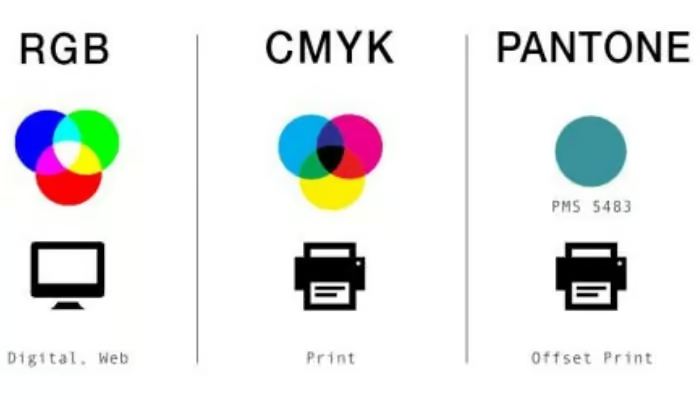
Choosing the right packaging box color starts with understanding how colors are defined and reproduced. In packaging design, the three primary systems, RGB, CMYK, and Pantone, serve different functions and require careful selection based on application.
RGB (Red, Green, Blue) is a screen-based system used for digital displays. While ideal for mockups and web visuals, RGB cannot be printed directly. Converting RGB to print often causes unexpected shifts in brightness or hue.
CMYK (Cyan, Magenta, Yellow, Black) is the standard for commercial printing. It blends inks during production, suitable for full-color images or gradient effects. However, CMYK can vary slightly between print runs or on different materials.
Pantone (PMS) offers pre-formulated spot colors with highly consistent results. It’s ideal for brand-critical tones, such as logos or signature box colors, where exact matching is essential across multiple packaging materials and suppliers.
Match Printing with Materials
Not all packaging box materials behave the same way under ink. To ensure accurate packaging box color, your printing method must be compatible with the substrate you choose; otherwise, even the most carefully selected color code can shift unpredictably.

Offset printing works best on coated white paperboard or ivory board. It delivers high-resolution results and reproduces CMYK and Pantone colors with consistency, making it ideal for premium packaging boxes in cosmetics, electronics, and food.
Flexographic printing, often used for corrugated boxes, suits large-volume runs with simpler graphics. However, it may struggle with fine detail or rich color saturation, especially on brown kraft board.
Digital printing offers flexibility for short runs or variable data, and performs well on smooth, bright surfaces. But it may not hold deep tones reliably on textured or absorbent substrates.
Uncoated kraft, recycled fiberboard, or linen-textured card absorb ink quickly, which mutes vibrancy and flattens contrast. For these materials, avoid subtle gradients or low-saturation colors.
Avoid Unreliable Colors
Certain colors look stunning on screen but are difficult, or impossible, to reproduce accurately on physical packaging boxes. Overlooking this can lead to faded prints, unexpected shifts, or costly reprints. To maintain brand consistency, it’s essential to avoid colors that behave unpredictably in real-world production.
Neon, fluorescent, and high-saturation digital colors are notorious for print issues. These shades rely on light emission in RGB environments and don’t translate well into CMYK or Pantone systems. The result is often duller or less vibrant than expected, especially on textured or recycled materials.
Very light tints or pale pastels can also pose risks. On kraft or uncoated substrates, they may become invisible or appear discolored. Metallic or pearlescent effects require specialized inks and coatings; standard print methods can’t replicate them faithfully.
To protect the integrity of your packaging box color:
- Avoid colors without a Pantone or CMYK match
- Request printed samples of your actual material
- Steer clear of effects that require light to function
Color Proofing and Sampling
No matter how accurate your color codes or how carefully you choose your material, the packaging box color must be verified in physical form before mass production. Digital mockups, even with correct CMYK or Pantone references, can’t simulate how color appears on real substrates under real lighting.
Color proofing allows you to catch deviations early. A printed sample, using the final ink, printing method, and box material, reveals how the color will truly look. This is especially important when working with textured surfaces, kraft paper, or specialty coatings that absorb or reflect ink differently.
A proper sampling process should include:
- Hard proofs: Printed samples for approval before full production
- Color swatches: Pantone or calibrated CMYK references for comparison
- Lighting tests: Reviewing under daylight, fluorescent, and ambient retail conditions
How to Communicate Color Requirements with Your Packaging Supplier?

Clear communication is essential to achieving accurate packaging box color. Misunderstandings during the pre-production phase often lead to costly errors, especially when dealing with international suppliers, multiple print technologies, or tight brand guidelines.
Provide Accurate Design Files
The foundation of accurate packaging box color lies in technically sound design files. Even with the right color references, improper file setup can cause serious production issues, from misaligned artwork to distorted hues.
Avoid sending low-resolution images or RGB mockups; printers work with production-level precision, not aesthetic guesses. Organized, layered, and properly prepared files ensure the color data you specify is preserved and interpreted correctly by every production technician involved.
To prepare reliable artwork:
- Use vector formats (AI, EPS, PDF) for logos, text, and dielines
- Ensure 300 dpi resolution for images or patterns
- Include bleed areas (typically 3–5mm) and marked cut lines
- Convert all fonts to outlines and embed or flatten all images
- Separate special finish layers (like spot UV or foil) with precise naming conventions
Use Standardized Color Codes
Designing a packaging box that looks right on screen is only half the battle. To achieve that same color in print, you must speak the printer’s language, using universal, standardized color systems like Pantone (PMS) or CMYK.
Pantone codes are ideal for brand-critical areas like logos, where even a small color shift can damage brand recognition. Pantone inks are pre-mixed, delivering consistent results across different runs, printers, and materials.
CMYK is best for photographic or gradient designs. However, because it blends colors on press, slight variation is more likely. Define your CMYK values explicitly and avoid relying on screen previews for approval.
Request and Approve Color Samples
No matter how precise your design files or color codes, physical sampling remains the most critical step in ensuring packaging box color accuracy. Without it, what looks perfect in theory may disappoint in execution, especially when printed on unfamiliar materials or using new finishes.
Request a printed sample, known as a hard proof, on the exact box material you’ll use. This reveals how ink behaves on that surface and allows you to spot issues like unexpected color shifts, dullness, or excessive absorption. For matte vs. gloss finishes, the same color can appear entirely different. Don’t rely on screen visuals to make those decisions.
Top Color Trends for Packaging Boxes
Packaging colors don’t just follow aesthetic preference; they evolve alongside cultural shifts, consumer psychology, and industry innovation. In 2025, brands are rethinking color as a tool for storytelling, sustainability, and shelf impact.
Earthy and Natural Tones

The rise of sustainability in packaging design has pushed earth-inspired colors to the forefront. Research shows 71% of consumers choose products based on sustainable packaging, and up to 82% would pay more for eco-friendly options, even reaching 90% among Gen‑Z buyers.
Expect to see more packaging boxes in shades like olive green, sand beige, terracotta, and stone gray. These colors pair well with recycled paper, kraft board, and uncoated textures, reinforcing a natural, handmade, or organic brand message.
Brands such as The Body Shop and Allbirds use muted green or kraft brown as their core packaging palettes to emphasize their environmental values. Earth tones also create a soft, honest look that contrasts with digital-age saturation.
Soft Pastel Colors

Soft pastel packaging box colors continue to resonate strongly in beauty, wellness, and self-care industries. These shades, like muted pinks, powder blues, and mint greens, project emotional calm, simplicity, and a sense of comfort, aligning closely with consumers’ desire for gentler visual experiences.
In 2025, WGSN and Coloro named Transcendent Pink and Aquatic Awe among their top color forecasts, both reflecting softness, emotional resilience, and environmental harmony. Meanwhile, fashion trend publications have highlighted a similar direction. WhoWhatWear listed butter yellow, lavender, and seafoam green among the defining colors for Spring/Summer 2025 collections.
Monochrome and Minimalist Styles

Minimalist color strategies continue to grow in popularity, especially in premium, lifestyle, and tech packaging. Clean white, deep black, or tonal grey palettes create a sense of clarity and restraint, qualities highly valued in mature markets and digital-first retail.
According to Adobe Express, 36% predict that natural and muted tones will dominate brand design in 2025. Meanwhile, a report by DesignRush shows that 95% of global top brands rely on monochrome or limited palettes for consistent identity and production efficiency
This trend works especially well for brands prioritizing sophistication, performance, or transparency. It also simplifies supply chain color matching across SKUs and regions.
Metallic and Foil-Inspired Shades
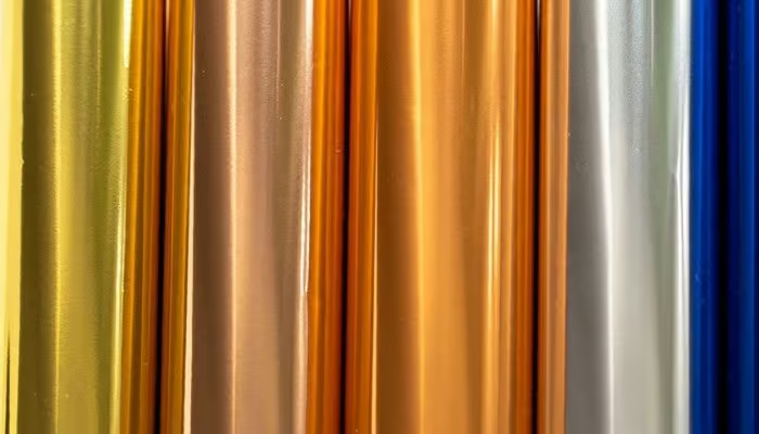
Metallic finishes continue to grow in demand across premium packaging categories, from cosmetics to spirits and jewelry. These finishes signal luxury, rarity, and celebration, offering both visual impact and tactile appeal. According to Datainsightsmarket projects, the hot stamping foil market will grow at over 4% annually through the next decade, driven by luxury and retail packaging demands.
However, precise application requires expert material matching and sampling. Inconsistent foil placement or poor adhesion can compromise the perceived quality. When executed properly, metallic colors add dimensionality and prestige, turning the box into a gift itself.
Design a Colorful Packaging Box With Gentlever Today
At Gentlever, we provide full-service support for custom packaging box color development, from concept to production. Our capabilities cover Pantone and CMYK color matching, ensuring consistent output across all materials and printing methods. We help clients define exact color codes for logos, brand accents, and base tones, then apply them accurately to coated, uncoated, kraft, or textured substrates.
We offer pre-production sampling, including printed mockups on your selected material, so you can approve color accuracy before mass printing. Our team assists in selecting the most suitable printing method, offset, digital, or flexo, based on your color requirements, volume, and surface needs.
Whether you’re scaling a luxury brand or launching a product line, we ensure your packaging box color looks exactly as intended, every time, in every batch.
Conclusion
Choosing the right packaging box color requires alignment with your brand identity, target market, and product category. It must account for cultural context, color psychology, material behavior, and production feasibility. Every decision, from selecting Pantone codes to matching substrates and finishes, affects how your packaging performs in real markets.
If you’re ready to create packaging that stands out and stays consistent, Gentlever is here to support you. From color matching and sampling to material guidance and full-scale production, we provide everything you need to execute your packaging vision with confidence.
Contact our team today to start your custom packaging box color development, with expert support at every step.