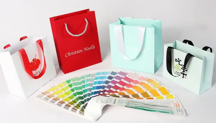
Custom box packaging is far more than just a protective shell—it’s a powerful tool for communicating your brand’s identity, values, and quality at first glance. In a competitive marketplace where visual appeal directly influences purchasing decisions, maintaining consistent and accurate color across all packaging is essential.
The Pantone Color Matching System (PMS) plays a key role in achieving that precision. From high-end gift boxes to sustainable kraft mailers, Pantone ensures your brand colors remain sharp, vibrant, and reliable across different materials and production runs.
This article breaks down how PMS works in custom box printing and how you can use it to elevate your packaging design color consistency.
What Is the Pantone Color Matching System (PMS)?
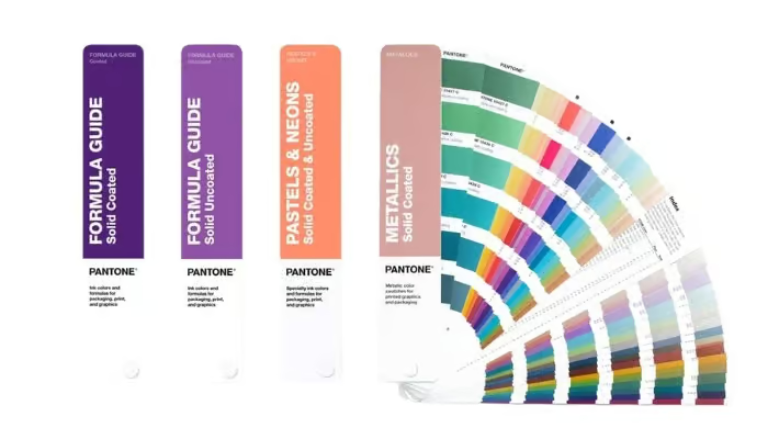
The Pantone Matching System (PMS) is a universally recognized color standard used across the design and print industries. It allows printers and packaging manufacturers to reproduce specific colors with high precision, regardless of where or how the printing occurs. Each Pantone color is assigned a unique code, ensuring that a brand’s signature red or luxury gold looks identical on a box printed in China or Germany.
Pantone’s system simplifies communication between brand owners, graphic designers, and box manufacturers. Instead of describing a color subjectively (like “dark teal”), stakeholders can refer to an exact Pantone code (e.g., Pantone 321 C), ensuring everyone is aligned. For business packaging buyers, especially those with global supply chains, Pantone plays a vital role in safeguarding color consistency across product lines and regions.
How the Pantone Matching System Works in Box Printing
Pantone colors are created by mixing specific ink formulas rather than relying on standard CMYK combinations. This allows for accurate reproduction of solid, vibrant, and specialty colors that are difficult or impossible to achieve with CMYK.
Printing on kraft or textured paper, for example, requires special attention. The same Pantone color may appear darker or duller on Kraft board compared to white paperboard. That’s why many experienced packaging suppliers run test prints and adjust ink formulations based on substrate and finish.
Why Pantone Colors Matter in Packaging Design
Color plays a powerful role in how customers perceive and connect with a brand. In packaging design, especially for custom boxes, using the right colors isn’t just about aesthetics—it’s about recognition, trust, and impact. This is where Pantone colors make a difference, ensuring your brand’s visual identity stays sharp, consistent, and professional across every box you produce.
Ensuring Brand Identity and Trust
Your brand’s color palette is a key part of its identity. Customers associate specific colors with quality, reliability, and recognition. Using Pantone colors guarantees that your logo red or signature blue appears exactly the same on every box, whether it’s the first run or the thousandth. This consistency builds customer confidence and strengthens your visual brand presence in competitive markets.
Enhancing Shelf Impact and Aesthetic Appeal
Color is a powerful sales tool. In a crowded retail environment, a perfectly matched Pantone color can make a product box pop. Whether you’re designing luxury cosmetic boxes or retail-ready electronics packaging, Pantone ensures rich, saturated hues that attract attention and elevate perceived value.
Maintaining Visual Consistency Across Print Runs and Suppliers
For global brands managing multiple suppliers, consistent color is a logistical challenge. Pantone removes ambiguity, allowing your Chinese box manufacturer and your European print house to produce visually identical results. This reduces reprint costs, avoids quality disputes, and streamlines procurement.
Pros and Cons of Using Pantone Colors
Color consistency is essential in packaging, especially when producing large volumes. The Pantone Matching System (PMS) helps ensure your brand colors stay accurate and professional.
However, like any tool in the packaging process, it comes with both strengths and trade-offs. Understanding the pros and cons of using Pantone colors will help you decide when and how to use them effectively in your custom box projects.
Pros of Using Pantone Colors
The Pantone Color Matching System offers clear advantages for custom box packaging. It provides precise and consistent color reproduction, ensuring your brand colors remain uniform across different materials and production runs. This level of control is especially valuable for premium packaging, where solid, vibrant colors enhance the visual appeal and perceived quality.
Furthermore, Pantone is also a globally recognized standard, which simplifies communication between designers, suppliers, and manufacturers, reducing the risk of color mismatches. For designs that rely on flat colors, logos, or bold accents, Pantone delivers a clean, professional finish that CMYK often struggles to achieve.
Cons of Using Pantone Colors
However, using Pantone also comes with some trade-offs. The setup cost is typically higher, making it less economical for small orders or frequent design changes. Since most digital printers rely on CMYK, Pantone colors often need to be simulated in short-run or on-demand printing, resulting in possible color shifts.
Additionally, the appearance of Pantone inks can vary based on the box material; kraft, textured, or recycled surfaces may absorb ink differently and affect the final look. Visual accuracy also depends on physical proofing, as screen previews can be misleading. Lastly, Pantone is not suitable for photo-heavy or gradient-based designs, where process color systems like CMYK perform better.
Pantone vs. CMYK in Packaging Printing

Choosing the right color system is a key decision in packaging printing. While both Pantone (PMS) and CMYK are widely used, they serve different purposes and deliver different results. Understanding how they compare helps ensure your custom box design meets both your brand standards and production goals.
Key Differences Table
| Feature | Pantone (PMS) | CMYK (Process Color) |
| Color Accuracy | Very High (Exact Match) | Medium (Subject to Variation) |
| Best For | Solid colors, brand logos | Photographic or full-color images |
| Cost Efficiency | Better for large runs | Ideal for short runs/digital |
| Appearance on Boxes | Rich, solid, consistent | It may look grainy or less vibrant |
| Print Method Compatibility | Offset, screen printing | Digital, offset, flexographic |
How Pantone Converts to CMYK
While Pantone colors offer superior accuracy, there are times—especially in digital or short-run printing—when a design must be printed in CMYK. In these cases, designers or printers use Pantone-to-CMYK conversion, either through design software like Adobe Illustrator or InDesign, or by referencing a Pantone Color Bridge Guide, which shows side-by-side comparisons of spot colors and their closest CMYK equivalents.
However, it’s important to note that not all Pantone colors can be accurately replicated in CMYK. Many PMS shades fall outside the CMYK color gamut, meaning the converted version may look duller, less vibrant, or slightly off-tone. For example, bright oranges, deep blues, and metallic-like shades often lose intensity when converted to process color.
To reduce discrepancies:
- Always preview the CMYK conversion on a Pantone Color Bridge under the same lighting conditions as your packaging environment.
- Choose Pantone colors with good CMYK match ratings if you know the design will be digitally printed.
- Ask your packaging supplier for physical proof prints of both Pantone and CMYK versions, especially on kraft or textured materials.
In summary, Pantone-to-CMYK conversion is possible but not always perfect. When exact brand color is critical—especially for rigid boxes, luxury packaging, or consistent retail presentation—Pantone spot color printing remains the preferred solution. For flexible, budget-friendly applications, CMYK may suffice with careful management.
When to Use Pantone vs. CMYK
Pantone is the right choice when:
- Brand color consistency is a top priority, such as in retail packaging, where exact logo colors must match across all boxes.
- You’re producing high-end rigid boxes or gift boxes that require a premium, professional finish.
- The design relies on clean, solid color blocks without gradients or photographic elements.
- Your packaging includes special effects like foil stamping, embossing, or spot UV that work best with Pantone spot colors.
- You’re managing large production runs where the cost of Pantone setup becomes more efficient.
CMYK is a better fit when:
- The box design includes detailed imagery, gradients, or full-color artwork that Pantone cannot reproduce.
- You need to print small batches, such as for limited editions or seasonal promotions, where digital printing is more practical.
- Your packaging type is a mailer box, folding carton, or e-commerce box printed on demand.
- You’re creating prototypes, mockups, or marketing samples where exact brand color is less critical.
- Budget and speed are more important than perfect color accuracy.
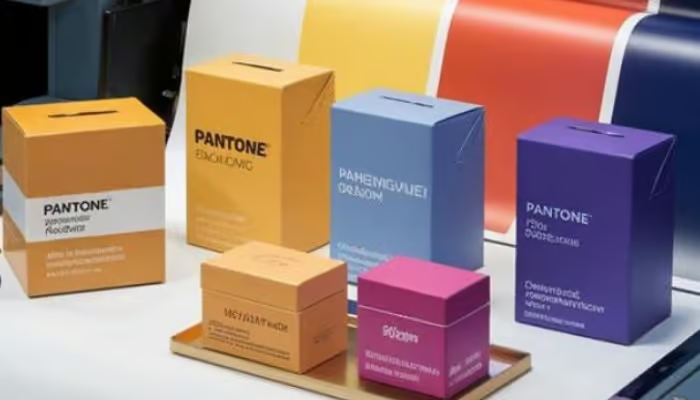
Pantone in Luxury and Sustainable Box Packaging
Pantone Matching System (PMS) plays a vital role in delivering precise, consistent color across different types of packaging. When applied to luxury boxes and sustainable materials, PMS ensures that brand colors remain sharp and reliable, regardless of surface texture, finish, or substrate. This section highlights how PMS supports both premium presentation and eco-conscious packaging without compromising color quality.
Luxury Boxes with PMS: Elevating the Unboxing Experience
In luxury packaging, every detail matters—from the structural design to the surface texture and, most critically, the color. PMS allows brands to achieve rich, elegant tones that standard CMYK printing often fails to reproduce. For example, a deep Pantone 2965 C navy or Pantone 872 C metallic gold can add sophistication and exclusivity that aligns with high-end consumer expectations.
Luxury brands such as Chanel, Jo Malone, and Apple use PMS for packaging consistency across product lines, ensuring that their black, beige, or silver tones remain visually perfect in every region and print run. The ability to match specific colors across rigid boxes, inner trays, and sleeves helps maintain the premium image customers expect.
Additionally, Pantone spot colors work exceptionally well with specialty finishes like foil stamping, embossing, soft-touch lamination, and spot UV, enhancing both the visual and tactile experience.
Sustainable Packaging with Pantone: Color Accuracy on Natural Materials

Sustainability no longer means sacrificing aesthetics. Many brands now seek to balance eco-friendly packaging choices with strong branding, and PMS helps make that possible. However, sustainable materials like kraft paper, uncoated board, and recycled substrates can absorb ink differently, which makes Pantone’s coated/uncoated variations (C/U) essential for color control.
Brands like Lush and Aesop use Pantone-matched inks on minimal, kraft-based packaging to reflect both their environmental values and refined brand presence. Pantone 7499 U, for instance, is often used for clean, creamy tones that print well on recycled paper.
A 2023 NielsenIQ survey found that 11.2% of people say that “environmentally friendly” and “sustainability” are the most important factors when choosing a brand. As demand for eco-conscious packaging grows, brands must find ways to maintain both visual appeal and environmental responsibility. The Pantone Matching System supports this balance by helping preserve accurate brand colors—even on recycled, uncoated, or kraft materials—without compromising sustainability goals.
Bridging Premium and Planet-Friendly Design
Using PMS in both luxury and sustainable box packaging bridges two critical brand objectives: elevated presentation and responsible material use. Whether you’re designing a premium rigid gift box with Pantone-matched embossing or a minimalist kraft box that aligns with eco-conscious values, PMS helps deliver a unified brand message—visually and ethically.
For businesses that want to achieve both impact and integrity, Pantone isn’t just a color tool—it’s a competitive advantage in custom box packaging.
How to Implement Pantone Matching in Custom Box Projects
Achieving accurate Pantone color reproduction in custom box packaging requires more than just selecting the right code—it involves clear communication, proper file setup, material consideration, and supplier coordination. To ensure your packaging turns out exactly as intended, it’s important to follow a structured process.

Add Pantone Codes to Your Artwork Files
Always include Pantone color codes directly in your design files (such as AI or print-ready PDFs). Avoid converting Pantone colors to CMYK unless your printer specifically requires it. Clear labeling of spot colors in your dieline helps the packaging supplier identify exactly which inks to use, reducing the risk of misprints or color mismatches.
Match PMS to Box Material and Finish
Pantone colors appear differently depending on the surface they’re printed on. For example, the same PMS color will look brighter on a glossy white rigid box than on a brown kraft mailer. Work with your supplier to choose the appropriate coated or uncoated ink version and test how the color appears on your chosen packaging materials. This step is especially important when working with textured, recycled, or sustainable materials.
Request Physical Color Proofs or Printed Samples
Digital previews can be misleading—screens vary in brightness and color calibration. To ensure accuracy, request a physical sample or ink drawdown printed on the actual material. This allows you to verify the final appearance under real lighting conditions before approving full production.
Work with an Experienced Packaging Partner
Pantone matching is a technical process that requires precise ink control and knowledge of material behavior. Choose a packaging supplier like Gentlever who has experience with PMS printing, offers coated/uncoated matching support, and can guide you through every step of the process. A knowledgeable partner will help you avoid costly revisions and deliver consistent results across print runs.
By following these steps, you can confidently bring your brand colors to life on custom boxes—with the clarity, consistency, and quality your customers expect.
Conclusion
Pantone isn’t just a color system—it’s a tool for building brand consistency, visual trust, and premium packaging experiences. Whether you’re launching a high-end cosmetics line or rebranding your e-commerce packaging, Pantone gives you the control to achieve perfect color every time.
At Gentlever, we specialize in custom box manufacturing with Pantone precision, sustainable materials, and world-class service. Want to ensure your next packaging project matches your brand vision exactly?
Request a Pantone-matched sample today or contact our team for a custom quote. Let’s make your packaging unforgettable.